
BLOG
5 Stunning Complementary Colors to Yellow You Must Try in 2025

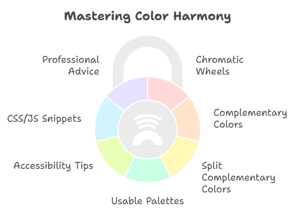
5 Stunning Complementary If you’ve ever paused mid-project wondering the true complementary color to yellow, you’re not alone. Ask five designers and you’ll hear “blue,” “purple,” and even “blue‑violet.” Why the debate? Because the complementary color to yellow changes by color model and context. This guide clears up the confusion and gives you practical, modern ways to pair yellow with confidence in 2025.
We’ll unpack chromatic wheels, show how complements differ for print vs. screen, map split complementary colors that always look smart, and share usable palettes with hex codes. You’ll also get accessibility tips, CSS/JS snippets for generating complements, and pro advice for branding, UI, fashion, interiors, and photography.
The quick answer: Is yellow’s complement blue or purple?
- On the modern RGB/HSL wheel (screens): complement is blue (a 180° hue shift from yellow).
- On the traditional RYB painter’s wheel: complement is purple/violet (across from yellow).
- In perceptual models (Munsell, CIE LCh/OKLCH): complement sits around blue‑violet, depending on the exact yellow and equal‑lightness matching.
In practice, you’ll get beautiful, balanced results pairing yellow with:
- Navy/royal/cerulean blues (digital, branding, UI)
- Indigo/blue‑violet/purple (print, fine art, editorial)
The richer your yellow (mustard, saffron), the deeper its complement (navy, indigo) should be.
Color theory 101: Chromatic wheels and why they disagree
When people argue about complements, they’re really arguing about chromatic wheels.
- RYB (Red‑Yellow‑Blue) painters’ wheel
- Historical, subtractive (pigments). Opposites: yellow ↔ violet, red ↔ green, blue ↔ orange.
- Great for art education and physical media mixing.
- RGB/HSV (screen) wheel
- Additive light. Opposites are computed as 180° on the hue circle.
- For yellow (H≈60°), complement is blue (H≈240°).
- CMY/CMYK (print) model
- Subtractive print primaries. Cyan opposes red, magenta opposes green, yellow opposes blue.
- Aligns with “yellow ↔ blue,” but ink behavior, paper, and profiles affect the visual result.
- Perceptual models: CIELAB/OKLCH
- Designed for uniformity across lightness (L), chroma (C), and hue (H).
- Complements are 180° hue apart at matched lightness/chroma—often visually a blue‑violet for saturated yellows.
Takeaway: Choose the wheel that matches your medium. Designing for web UI? Think yellow ↔ blue. Painting or print illustration? Think yellow ↔ violet/blue‑violet.
What colors make yellow? It depends on light vs. paint
This question trips up a lot of creators.
- In light (additive color, screens): red + green = yellow.
- In paint/ink (subtractive color): yellow is a primary (you don’t “mix” it cleanly from other paints).
- In casual craft mixing, combining near‑complements often produces browns/olives, not clean yellow.
Knowing what colors make yellow in different systems helps you predict how adjacent hues will interact and how glazes/overlays might shift your final look.
The complement changes with the shade of yellow
Think of “yellow” as a family. Warmer vs. cooler yellows nudge the best complementary pick.
- Lemon yellow (#FFF44F): crisp with royal blue (#4169E1), clean with cobalt (#0047AB).
- Canary yellow (#FCE205): pairs beautifully with true blue (#0033FF) or lapis (#26619C).
- Golden yellow (#FFC300): loves indigo (#3F51B5) and navy (#0B1D51).
- Mustard (#D4A017): richest with deep navy (#0A2342) or blue‑black (#0B1220).
- Saffron (#E3A008): sings with ultramarine (#1F3C88) or blue‑violet (#5B5BD6).
Tip: As the yellow deepens, darken and cool the complement to keep contrast and elegance.
Split complementary colors for yellow: safer, more flexible palettes
If a direct complement feels too intense, use split complementary colors—two hues flanking the complement. For yellow, that often means one blue‑violet and one red‑violet (RYB tradition), or blue‑green and blue‑violet (RGB tradition). Both work. Pick the set that suits your medium.
- RYB‑style splits for yellow:
- Blue‑violet (e.g., #6A5ACD)
- Red‑violet (e.g., #C71585)
- RGB‑style splits for yellow:
- Blue‑green/cyan‑blue (e.g., #1CA3EC)
- Blue‑violet (e.g., #5B5BD6)
Practical use: make yellow your hero, then use one split as the primary accent and the other for micro‑details (icons, rules, tags). The result feels rich but controlled.
Triads, tetrads, and the broader palette logic
- Triadic with yellow (RGB wheel): yellow + blue + red.
- High‑energy and classic. Works well in kids’ brands, sports teams, and bold editorial.
- Tetradic (rectangle): yellow with blue + red + green variants.
- Powerful but harder to balance; anchor with plenty of neutral space and a clear hierarchy.
You asked: what colors go with red? In hue logic, green is the opposite color of red, but in a triad with yellow, red pairs cohesively with blue and yellow. Use red sparingly as a focus color when yellow is your base.
Accessibility and readability: getting yellow right in UI and brand
Yellow is luminous but tricky for text: it’s naturally low in perceived contrast against light backgrounds.
- Avoid pure yellow text (#FFFF00) on white. It fails WCAG.
- For on‑blue backgrounds, use richer yellows (#FFC107, #E0A106) to achieve 4.5:1 contrast for body text and 3:1 for large text.
- For buttons: yellow background with dark navy text often passes easily.
- Check with a contrast tool (WCAG 2.2 or newer). Aim for AA minimum; AAA where practical.
Micro‑tip: If a yellow accent vibrates on blue (visual “buzz”), darken the blue a notch and desaturate the yellow by ~5–10%.
Practical palettes: tried‑and‑true combos with hexes
Use these as starting points, then tweak to taste.
- Clean tech
- Yellow: #FFD54F
- Navy: #0B1D51
- Slate: #475569
- White: #FFFFFF
- Editorial chic
- Golden: #FFC300
- Indigo: #3F51B5
- Charcoal: #2B2B2B
- Bone: #F9F7F2
- Sporty bold
- Bright yellow: #FFE000
- Royal blue: #4169E1
- Jet black: #121212
- Cool gray: #9CA3AF
- Heritage modern
- Mustard: #D4A017
- Blue‑black: #0B1220
- Cream: #F5F3E7
- Copper accent: #B87333
- Coastal light
- Lemon: #FFF44F
- Lapis: #26619C
- Mist: #E6EEF7
- Driftwood: #A78B71
Real‑life example: a brand refresh that clicked
“I’d always paired our sunny yellow with a mid blue, but the CTAs felt loud and ‘cheap.’ We tested a deeper navy and nudged the yellow toward golden. Conversions rose 11% and we finally passed AAA for our core buttons. Same brand vibe—just more trustworthy.”
Lesson: The right shade of the complement—often darker and cooler—can transform both aesthetics and accessibility.
Opposite color of green: a quick detour that helps
This question comes up as soon as complements enter the chat. On RGB/HSV wheels, the opposite color of green is magenta (green H≈120° ↔ magenta H≈300°). On RYB painter’s wheels, green’s opposite is red. Both answers are “correct” inside their respective systems. Remember: choose your wheel by medium.
When to use blue vs. violet as the complement
- Choose blue for:
- Digital products and brand systems
- Crisp, modern, tech, or sporty aesthetics
- High‑contrast UI and wayfinding
- Choose violet/blue‑violet for:
- Editorial, print, fashion, and illustration
- Luxe, artful, or romantic moods
- Analog media and layered pigment effects
Try both in a quick mock; your content and audience will tell you which sings.
CSS and JS: generate a complement the smart way
If you’re building design systems, it’s handy to compute complements programmatically.
In HSL with JavaScript:
JavaScriptfunction toHsl({ r, g, b }) {
  r/=255; g/=255; b/=255;
  const max = Math.max(r, g, b), min = Math.min(r, g, b);
  let h, s, l = (max + min) / 2;
  if (max === min) { h = s = 0; }
  else {
    const d = max - min;
    s = l > 0.5 ? d / (2 - max - min) : d / (max + min);
    switch (max) {
      case r: h = (g - b) / d + (g < b ? 6 : 0); break;
      case g: h = (b - r) / d + 2; break;
      case b: h = (r - g) / d + 4; break;
    }
    h *= 60;
  }
  return { h, s, l };
}

function fromHsl({ h, s, l }) {
  const C = (1 - Math.abs(2*l - 1)) * s;
  const X = C * (1 - Math.abs(((h/60)%2) - 1));
  const m = l - C/2;
  let [r,g,b] = [0,0,0];
  if (h < 60) [r,g,b] = [C,X,0];
  else if (h < 120) [r,g,b] = [X,C,0];
  else if (h < 180) [r,g,b] = [0,C,X];
  else if (h < 240) [r,g,b] = [0,X,C];
  else if (h < 300) [r,g,b] = [X,0,C];
  else [r,g,b] = [C,0,X];
  return {
    r: Math.round((r+m)*255),
    g: Math.round((g+m)*255),
    b: Math.round((b+m)*255)
  };
}

function complementHex(hex) {
  const bigint = parseInt(hex.replace('#',''), 16);
  const r = (bigint >> 16) & 255;
  const g = (bigint >> 8) & 255;
  const b = bigint & 255;
  const hsl = toHsl({r,g,b});
  const comp = { h: (hsl.h + 180) % 360, s: hsl.s, l: hsl.l };
  const { r: rr, g: gg, b: bb } = fromHsl(comp);
  return '#' + [rr,gg,bb].map(x => x.toString(16).padStart(2,'0')).join('');
}
CSS tip (2025):
- Use OKLCH in modern browsers for more reliable, perceptually uniform tweaks.
- You can’t rotate hue in CSS alone yet, but you can author with
oklch()and pick complements manually.
Example tokens:
CSS:root {
  --y: oklch(0.85 0.12 100);        /* a sunny yellow */
  --y-comp: oklch(0.85 0.12 280);   /* ~+180° hue -> blue-violet */
}
- Buttons: Yellow background, navy text; navy outline on hover for premium feel.
- Alerts: Pair yellow warning banners with deep blue icons for legibility.
- Charts: Use yellow for highlights; balance with a blue series; keep neutrals for filler bars.
- Data viz: If the background is dark, desaturate the complement slightly to prevent “vibration.”
Accessibility check: test all states (default, hover, focus, disabled) for contrast. Add a 2px focus ring that’s visible on both yellow and blue.
Interiors and styling: how to pull it off IRL
- Mustard sofa + navy throws = instantly sophisticated.
- Lemon accents in a blue‑and‑white kitchen read fresh, not juvenile.
- Soft gold hardware against indigo cabinets feels boutique‑hotel chic.
- Keep walls neutral if you’re anxious; bring color via textiles and art.
Rule of thumb: 60/30/10 balance—dominant neutral (60%), secondary complement (30%), accent yellow (10%)—or reverse it for energetic spaces.
Fashion and branding: making statements without shouting
- Streetwear: deep navy jacket, mustard cap, white tee—timeless.
- Beauty: golden packaging with blue foil type conveys clarity and trust.
- Branding: golden yellow as the hero, navy for copy/navigation; add a slate gray to calm the system.
Tip: In logos, keep the yellow shape dominant and let the blue handle fine details (type, lines) to avoid low-contrast edges.
Photography and content: make yellow behave on camera
- Yellow can clip highlights; expose for the yellow subject to keep detail.
- Against blue skies, use a polarizer to deepen the blue without oversaturating the yellow.
- In post, adjust luminance before saturation to keep texture.
Risks and how to avoid them
- Vibrating edges: intense yellow against saturated blue can shimmer. Fix = darken the blue and/or desaturate yellow slightly.
- Low contrast: yellow text over light backgrounds fails WCAG. Fix = use dark text or a darker gold.
- Print surprises: blues shift toward purple on uncoated stock; run proofs, use proper profiles.
Tools and workflows you’ll love in 2025
- Browser devtools color pickers now preview contrast ratios live—use them.
- Figma/Sketch plugins that compute split complementary colors and accessible variants.
- OKLCH/OKLAB in CSS and design tools for perceptual control over chroma/lightness.
- Palette management with tokens (Design Tokens W3C working draft) for multi‑platform consistency.
FAQs
Both, depending on the wheel. On RGB/HSV (screens), it’s blue. On RYB (painting), it’s purple/violet. In perceptual models, it often lands in blue‑violet. Choose the model that matches your medium.
In light (additive), red + green makes yellow. In paint (subtractive), yellow is a primary—you don’t mix a clean yellow from other pigments. For crafts, mixing near‑complements usually makes browns, not bright yellow.
Traditionally: blue‑violet and red‑violet. On the RGB wheel: blue‑green and blue‑violet. Use them when a direct complement feels too high‑contrast; they’re easier to balance in UI and brand palettes.
On RGB/HSV wheels, magenta is opposite green. On RYB painter’s wheels, it’s red. Both are contextually correct.
In a triad, red pairs well with yellow and blue. To avoid clashes, keep red as an accent (small areas, callouts) and let blue handle larger blocks or typography to anchor the composition.
Go deep: navy (#0B1D51) or indigo (#3F51B5). They add sophistication and improve contrast for UI and print.
Yes—if the blue is dark enough and the yellow is slightly deeper. Aim for a 4.5:1 contrast ratio. Often, dark text on yellow gives a more reliable pass.
Convert to HSL, add 180° to the hue, preserve saturation and lightness, then convert back. For better perceptual results, work in OKLCH and rotate hue by 180°.
Wrap-up
The complementary color to yellow isn’t a single color—it’s a set of best answers guided by your medium and intent. For screen work, think yellow ↔ blue. For painting and some print/editorial looks, yellow ↔ violet/blue‑violet. When in doubt, use split complementary colors for flexible, refined palettes.

Routine maintenance isn’t just about oil changes. It includes checking your brakes, tires, fluids, and engine components. Regular inspections help catch small issues before they become major repairs. For example, a blinking engine light is a warning sign that should never be ignored. Addressing it promptly can prevent more serious engine damage and expensive repairs.
Common Auto Repair Tips
- Check Your Engine Light:
If your engine light starts blinking, it’s a sign that your vehicle needs immediate attention. Ignoring it can lead to severe engine problems. For more information on what a blinking engine light means and what steps to take, visit Central Avenue Automotive. - Monitor Fluid Levels:
Regularly check your oil, coolant, brake, and transmission fluids. Low or dirty fluids can cause significant damage to your vehicle’s systems. - Inspect Tires and Brakes:
Worn-out tires or brakes can compromise your safety. Make sure to inspect them regularly and replace them as needed. - Replace Air Filters:
A clean air filter improves engine performance and fuel efficiency. Check your air filter every 12,000 to 15,000 miles. - Schedule Regular Tune-Ups:
Routine tune-ups help keep your engine running efficiently and can catch potential issues early.
Choosing a Reliable Auto Repair Shop
Selecting a trustworthy auto repair shop is just as important as performing regular maintenance. A reputable shop will provide honest assessments, quality repairs, and fair pricing. Look for shops with certified technicians, positive customer reviews, and transparent communication.
One such trusted provider is Central Avenue Automotive, located in Kent, WA. They specialize in a wide range of vehicle services and are known for their expertise and customer-focused approach. By choosing a reliable shop like Central Avenue Automotive, you can ensure your vehicle receives the best care possible.
Save Time and Money with Preventive Care
Investing in regular maintenance and working with a reputable auto repair shop can save you from unexpected breakdowns and expensive repairs. Preventive care not only extends the life of your vehicle but also gives you peace of mind on the road.
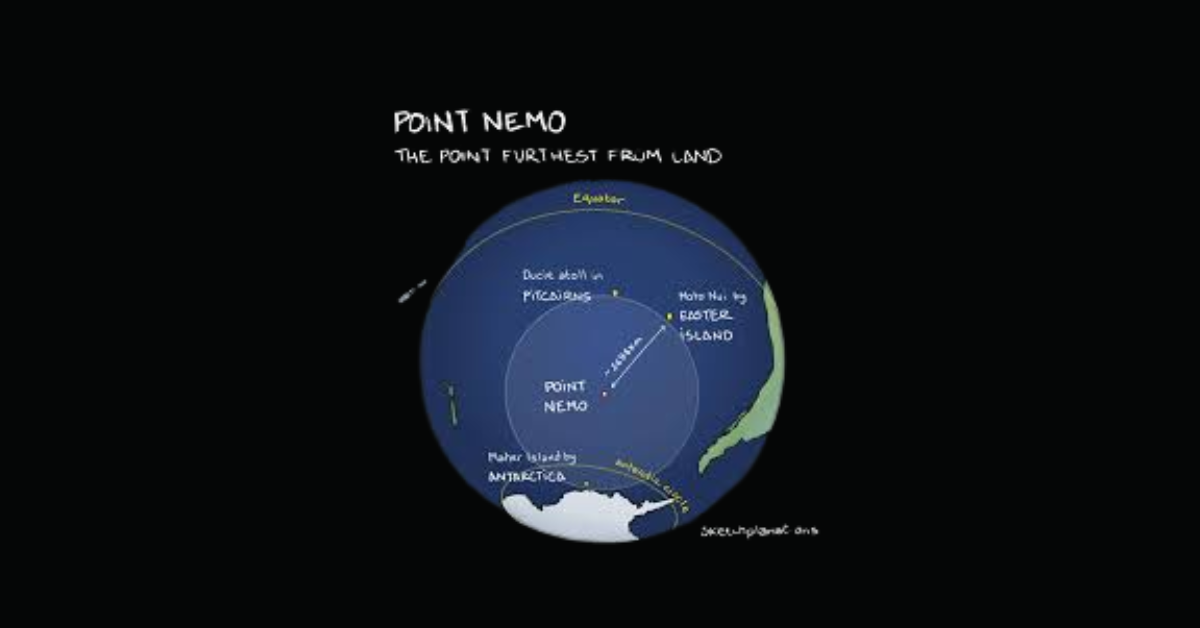
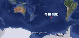
When most people dream of adventure, they imagine climbing tall mountains or trekking through vast deserts. But what if I told you the true frontier of remoteness isn’t a mountain peak or desert at all, but a lonely spot far out in the ocean? Meet Point Nemo, a location so isolated that the nearest humans are usually astronauts orbiting above the planet on the International Space Station. No roads, no islands, no nearby shores—just water, thousands of miles of it.What is Point Nemo?
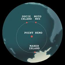
Point Nemo isn’t a landmass. It’s a precise coordinate in the South Pacific Ocean, located at 48°52.6′S 123°23.6′W. Think of it as the ocean’s “middle of nowhere.” To get there, you’d need to travel about 2,700 kilometers (1,450 nautical miles) in any direction to reach the nearest land.
That’s farther than most people ever sail in a lifetime. For context, it’s like being in the middle of New York, Los Angeles, and Chicago combined—with no highways, no airplanes, no way for anyone to stop by for a cup of coffee.
Its name comes from Latin—“Nemo” means “nobody.” And as anyone who has gazed at a map of the South Pacific will tell you, this spot certainly lives up to its name.
Why Point Nemo Is Called the Most Remote Place in the World
When scientists calculated Point Nemo in 1992, they used computer software to locate the spot in the world’s oceans that was farthest from land. It dethroned mountain deserts and icy tundras, becoming the official winner of isolation.
So why does it hold the crown for the most remote place in the world?
- Distance from Human Civilization: The closest pieces of land are uninhabited islands like Ducie Island (Pitcairn Islands), Motu Nui (near Easter Island), and Maher Island (near Antarctica). None have residents.
- High Ocean Desolation: Even ships rarely traverse these waters. International shipping lanes are hundreds of miles away.
- Proximity to Space Travelers: Astronauts orbit Earth at about 420 kilometers above on the ISS—closer to Point Nemo than any land-dweller.
One oceanographer joked: “If you felt lonely there, you’d be closer to tweeting an astronaut than asking a neighbor for sugar.”
Point Nemo Flag: Symbol of Isolation
Over time, Point Nemo has sparked cultural movements. Some explorers, cartographers, and internet users even promoted a Point Nemo flag—a fictional banner to represent the most desolate place on Earth.
It usually incorporates symbols of the ocean, compass designs, or abstract nautical art. Though not officially recognized by any government, the flag symbolizes humanity’s fascination with extreme frontiers. For many, it’s a playful nod to exploration in an otherwise unreachable part of the map.
The Most Desolate Place on Earth
If we measure desolation as lack of life, contact, or activity, Point Nemo might be the most desolate place on Earth.
- No Tourism: Unlike Antarctica or the Sahara, there are no tour packages to Point Nemo. Reaching it requires a private expedition, satellite navigation, and serious resources.
- Sparse Marine Life: The waters are part of the South Pacific Gyre, an area with low nutrient flow. It’s one of the ocean’s great “biological deserts.”
- No Natural Landmarks: Unlike other remote areas, there’s no island, no rock formation—just endless sea on every horizon.
It’s almost poetic: a place equally unreachable to travelers and animals alike.
Point Nemo and the Spaceship Cemetery
Here’s where things get mind-bending. NASA and other space agencies use Point Nemo as a spacecraft graveyard.
When satellites, rocket modules, and even space stations reach the end of their lifespan, they’re deorbited into Earth’s atmosphere. The safest way to drop them? Over a remote patch of ocean where they won’t hit anyone—right above Point Nemo.
As of 2025, more than 260 spacecraft have been intentionally crashed there, including Russia’s Mir space station in 2001. That’s why some people call it the “underwater Point Nemo”—a reminder that beneath its waves lies humanity’s space junkyard.
It’s eerie to imagine real-life “ghosts of technology” resting on the seabed of the most isolated place in the world.
Point Nemo vs. Other Remote Places
We love ranking extremes. So how does Point Nemo compare to the world’s other most remote places on Earth?
Tristan da Cunha (South Atlantic)
- Remote inhabited island.
- Population: ~250.
- Known as the remotest lived-in place.
Oymyakon, Siberia
- Coldest permanently inhabited settlement.
- Winters reach -67°C, but at least humans live there.
Antarctic Plateau
- Huge frozen desert.
- No permanent population, only research scientists.
Point Nemo (South Pacific)
- No land, no population, no infrastructure.
- By definition, the furthest spot from civilization.
Result? Point Nemo wins when “isolation” is defined by distance from humanity.
Underwater Point Nemo: What Lies Beneath?
The ocean floor under Point Nemo is about 13,000 feet deep. It’s part of the Pacific abyssal plain. Unlike coral reefs or volcanic ridges, there aren’t dramatic underwater structures here.
Scientists know little about life in this area because expeditions are rare. Still, microbes capable of surviving on minimal energy sources likely thrive there. Some even speculate undiscovered species waiting in the shadows.
In 1997, mysterious underwater sounds nicknamed “The Bloop” were traced back near Point Nemo. Some thought it was a sea monster. Later, NOAA scientists confirmed it was most likely the sound of icebergs cracking. Still, the association with Point Nemo adds to its legend.
Psychological Fascination with Isolation
Humans have always been curious about isolation. We flock to the most isolated places in the world because they push our imagination. Point Nemo isn’t just geographical trivia; it symbolizes ultimate solitude.
In a world overwhelmed by digital notifications and constant crowds, the idea that such untouched places exist is oddly comforting. It reassures us that even in 2025, Earth still keeps secrets.
A user once tweeted: “Point Nemo comforts me. Somewhere out there is a place so alone that even satellites need directions to find it. Reminds me not everything has to be connected.”
Challenging the Journey
Could you visit Point Nemo? Technically, yes—but few have. Here’s why:
- Logistics: A round trip might cost tens of thousands of dollars for fuel, crew, and supplies.
- Safety: Storms, navigation errors, and lack of rescue services make it dangerous.
- Purpose: There’s nothing visible to “see” upon arrival. It’s all psychological.
Unlike climbing Everest or trekking the Amazon, arriving at Point Nemo doesn’t give you breathtaking views—it gives you awareness of distance itself.
The Allure of Human Curiosity
Point Nemo represents more than ocean emptiness. It symbolizes our need to map the unseeable. Scientists, adventurers, and even artists look at it differently:
- For scientists: It’s a waypoint in oceanography and aerospace safety.
- For philosophers: A metaphor for ultimate loneliness.
- For writers: Inspiration for stories about mystery and the unknown.
And while thousands may never go there, millions dream about the concept of it.
FAQs About Point Nemo
1. Why is Point Nemo so special?
Point Nemo is the most remote place on Earth, located more than 2,700 km from the nearest land. It’s unreachable, desolate, and symbolic of pure isolation.
2. Can people travel to Point Nemo?
Yes, but it’s extremely difficult. You’d need a private vessel, expert navigation, and serious funding. There are no tours or casual visits.
3. What is underwater at Point Nemo?
The seafloor is about 13,000 feet below, with scattered spacecraft debris. NASA and other agencies use it as a controlled crash site for deorbited satellites.
4. Is Point Nemo the most isolated place in the world?
By definition, yes. While remote islands and icy outposts are far away, Point Nemo is literally the furthest you can get from any land.
Final Thoughts
Point Nemo is Earth’s ultimate reminder that not every corner is within human reach. In an age of instant communication, maps, and satellites, this place whispers: Here lies true distance.
Whether you see it as the most desolate place on Earth, a spacecraft graveyard, or simply romantic emptiness, Point Nemo matters because it exists. Like the moon or Mars, it calls to our imagination—highlighting how mystery still lingers in our oceans.

Growing lavender successfully starts with choosing the right soil. Whether you’re a home gardener, herbalist, landscape designer, or indoor plant enthusiast, the soil you select directly impacts plant health, fragrance, and flowering. In this guide, we’ll cover everything you need to know about lavender best soil, including preparation tips, nutrient requirements, and growing strategies.
Why Soil Matters for Lavender Growth
Lavender is a Mediterranean herb that thrives in well-draining, nutrient-rich soil. The right soil ensures:
- Healthy root development
- Vibrant blooms and strong fragrance
- Resistance to root rot and disease
- Optimal growth in containers or gardens
Expert Citation: According to the Royal Horticultural Society, “Lavender plants require well-drained soil with a slightly alkaline pH to flourish.”
Key Soil Requirements for Lavender
Well-Draining Soil
- Prevents waterlogging, which can cause root rot.
- Ideal types: sandy, loamy, or rocky soil.
- Avoid clay-heavy soil unless amended.
Optimal pH Levels
- Lavender prefers a slightly alkaline to neutral pH (6.5–7.5).
- Test soil pH before planting; use lime to raise acidity if needed.
Soil Texture and Composition
| Soil Type | Benefits for Lavender | Notes |
|---|---|---|
| Sandy Soil | Excellent drainage, easy root growth | May require organic amendments for nutrients |
| Loamy Soil | Balanced drainage and fertility | Best for garden beds |
| Clay Soil | Retains moisture | Must be amended with sand or gravel for proper drainage |
Preparing Soil for Lavender Plants
Step-by-Step Soil Preparation:
- Clear the area: Remove weeds, debris, and rocks.
- Test pH: Use a soil test kit; adjust as needed with lime or sulfur.
- Improve drainage: Add sand, gravel, or organic compost for clay or dense soil.
- Add nutrients: Incorporate well-rotted compost or organic fertilizer.
- Form raised beds (optional): Helps excess water drain quickly.
LSI Integration: These steps ensure well-draining soil for lavender, perfect for both potted plants and garden beds.
Best Soil Mix for Potted Lavender
For indoor gardeners or container planting:
- 1 part potting soil
- 1 part coarse sand or perlite
- 1 part compost or aged manure
This mixture provides fertile soil for aromatic herbs, excellent aeration, and sufficient nutrients for growth.
Expert Citation: University of California Agriculture & Natural Resources recommends using a sandy-loam potting mix for container-grown lavender.
Organic Soil Amendments for Lavender
- Compost: Enhances nutrient content.
- Perlite or pumice: Improves aeration and drainage.
- Dolomitic lime: Balances pH for slightly alkaline conditions.
- Gravel or sand: Prevents water retention in heavy soils.
These amendments create ideal Mediterranean soil types, replicating lavender’s native environment.
Common Soil Mistakes to Avoid
- Using water-retentive clay soil without amendments
- Planting in acidic soil (pH <6.0)
- Over-fertilizing, which can reduce blooms
- Ignoring drainage in containers or raised beds
Tip: Always check soil moisture before watering to prevent root rot.
FAQ’s
What is the best soil for growing lavender?
Well-draining sandy or loamy soil with a slightly alkaline pH (6.5–7.5) is ideal for healthy lavender plants.
How to prepare soil for lavender plants?
Clear weeds, test pH, amend with sand or compost, and consider raised beds for optimal drainage.
Lavender soil pH and nutrient requirements
Lavender thrives in slightly alkaline to neutral soil; moderate organic amendments are sufficient for nutrients.
Which soil type does lavender grow best in?
Sandy or loamy soils are preferred; clay soils must be amended to ensure proper drainage.
Tips for improving soil drainage for lavender
Add sand, gravel, or perlite, plant in raised beds, and avoid waterlogging.
Best soil mix for lavender in pots or containers
Mix equal parts potting soil, sand/perlite, and compost for fertility and aeration.
Conclusion
In conclusion, choosing the lavender best soil is essential for vibrant blooms, healthy roots, and thriving plants. By using well-draining, nutrient-rich soil and following proper preparation tips, gardeners and plant enthusiasts can ensure their lavender flourishes in both gardens and containers.
-

 BLOG9 months ago
Berniece Julien: The Quiet Power Behind the Spotlight
-

 BLOG9 months ago
Cineby App (2025): Features, Download & Fixes Guide
-

 ENTERTAINMENT9 months ago
Erome Uncovered: A Closer Look at the NSFW Content Platform
-

 EDUCATION9 months ago
42°C to °F – Real Impact of Extreme Heat
-

 ENTERTAINMENT9 months ago
ScoutedToday: Discovering Tomorrow’s Talent Today
-

 TECH9 months ago
How to Fix ‘Fatal glibc error: CPU Does Not Support x86‑64‑v2’ on Legacy Hardware
-

 TECH9 months ago
Caricatronchi: Redefining Digital Caricature
-

 ENTERTAINMENT9 months ago
MangaFire Explored: Your Gateway to Free Manga Reading