
TECH
5 Critical Ajax Error Fixes You Can’t Ignore in 2025

5 Critical Ajax Error Fixes If you’ve ever encountered an ajax error while developing or maintaining a website, you know how frustrating it can be. Whether it’s a mysterious failure in your asynchronous requests or a specific issue like ajaxerror: ajax error 400, these errors can disrupt user experience and stall your project. But why do these errors happen, and how can you fix them efficiently?
In this comprehensive guide, we’ll break down everything you need to know about ajax error troubleshooting in 2025. From understanding the infamous ajax error 400 to mastering javascript ajax post with data as variables, and even tackling the notorious slider revolution ajax error, this article covers it all. Ready to turn those errors into smooth, seamless interactions? Let’s dive in.
What Is an Ajax Error and Why Does It Occur?
Ajax (Asynchronous JavaScript and XML) allows web pages to update asynchronously by exchanging data with a server behind the scenes. This means parts of a page can update without a full reload, enhancing user experience.
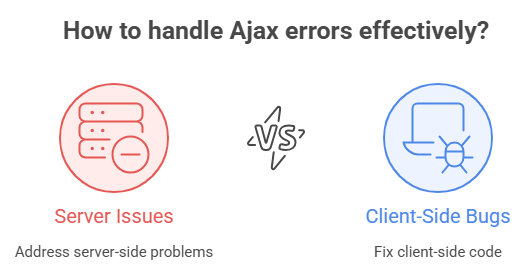
However, when something goes wrong during this data exchange, you get an ajax error. These errors can stem from server issues, incorrect request formats, network problems, or client-side bugs.
Understanding ajaxerror: ajax error 400
One of the most common Ajax errors is the ajaxerror: ajax error 400. This error corresponds to the HTTP 400 Bad Request status, indicating that the server cannot process the request due to malformed syntax or invalid data.
Common Causes of Ajax Error 400
- Incorrect URL or endpoint in the Ajax request
- Missing or invalid parameters in the request
- Improper content-type headers
- Server-side validation failures
Fixing this requires careful inspection of your request payload and server expectations.
How to Handle Ajax Error 400 Effectively
- Check the Request URL: Ensure the endpoint is correct and accessible.
- Validate Data Sent: Confirm all required parameters are included and properly formatted.
- Set Correct Headers: Use appropriate content-type headers like
application/jsonif sending JSON data. - Review Server Logs: Server-side logs often reveal why the request was rejected.
Javascript Ajax Post with Data as Variables: Best Practices
Sending data via Ajax POST requests is common, but mistakes here often trigger errors like 400. Here’s how to do it right:
JavaScript$.ajax({
  type: "POST",
  url: "/your-endpoint",
  data: {
    name: variableName,
    age: variableAge
  },
  success: function(response) {
    console.log("Success:", response);
  },
  error: function(xhr, status, error) {
    console.error("Ajax error:", error);
  }
});
Make sure your variables (variableName, variableAge) are defined and contain valid data before sending.
Slider Revolution Ajax Error: What You Need to Know
If you use Slider Revolution on your website, you might have encountered the slider revolution ajax error. This error often occurs due to conflicts with caching plugins, outdated Slider Revolution versions, or server restrictions.
How to Fix Slider Revolution Ajax Error
- Clear your site and browser cache.
- Update Slider Revolution to the latest version.
- Check for plugin conflicts by disabling others temporarily.
- Increase PHP memory limits if necessary.
Real-Life Example: Ajax Error 400 Resolved
A developer shared:
“I kept getting ajaxerror: ajax error 400 when trying to submit a form. Turns out, I was missing a required CSRF token in my POST data. Adding it fixed the issue instantly.”
Pros and Cons of Using Ajax in 2025
| Pros | Cons |
|---|---|
| Enhances user experience with async updates | Debugging errors like ajax error 400 can be tricky |
| Reduces server load by partial page updates | Requires careful handling of data and headers |
| Works well with modern frameworks and APIs | Can cause security issues if not properly validated |
FAQs
It’s usually caused by malformed requests, missing parameters, or incorrect headers sent to the server.
Pass your variables as key-value pairs in the data property of the Ajax call, ensuring they are properly defined.
Common reasons include plugin conflicts, outdated versions, or server resource limits.
Use browser developer tools to inspect network requests and server responses, and check server logs for detailed error messages.
Final Thoughts
Ajax errors like ajaxerror: ajax error 400 can be frustrating, but with the right knowledge and tools, you can troubleshoot and fix them quickly. Whether you’re sending data with javascript ajax post with data as variables or managing complex plugins like Slider Revolution, understanding these errors is key to smooth, modern web development.

The self-publishing landscape has undergone a massive transformation over the past decade. Gone are the days when aspiring authors needed agents or printing houses to share their work. sparkpressfusion com self-publishing platform modernizes this process, offering seamless publishing tools designed to help creators distribute, promote, and monetize their content—all in one place.
Unlike traditional publishing software, this platform allows users to upload manuscripts, design eBooks, and distribute across multiple online stores without any technical barriers. It combines ease of use with professional-grade features, making it accessible to both beginners and experienced authors.
One of the standout aspects of sparkpressfusion com is its intuitive workflow. It minimizes the learning curve with drag-and-drop templates, AI-powered editing tools, and automated formatting. Authors can customize layouts, add metadata, and prepare their books for global platforms in minutes.
The sparkpressfusion com Content Creation Tool
Creating quality content in 2025 requires more than good writing—it demands structure, data, and design integration. The sparkpressfusion com content creation tool helps users develop blogs, newsletters, and multimedia posts efficiently. It’s a space where creativity meets technology.
Users can manage their entire content lifecycle: from brainstorming and drafting to SEO optimization and final publication. The built-in writing environment includes collaboration tools that allow multiple contributors to work simultaneously—perfect for agencies and teams. The AI-driven editor also provides readability suggestions, tone analysis, and keyword recommendations, ensuring every piece aligns with search engine best practices and audience expectations.
This streamlined system not only saves time but also improves the overall quality of the output. By leveraging data-driven recommendations, creators can maintain consistency and professionalism across all projects.
sparkpressfusion com AI Writing Assistant: Powering Creativity with Intelligence
Artificial intelligence continues to redefine the creative process. The sparkpressfusion com AI writing assistant goes beyond mere text generation—it acts as a creative partner. This intelligent tool assists in brainstorming headlines, expanding ideas, rewriting sections for clarity, and even adjusting tone based on target audience.
For instance, if an author is writing a technical article, the AI ensures precision and industry-standard terminology. For lifestyle or storytelling content, it adapts to a conversational tone. Its contextual understanding enhances creativity without compromising authenticity.
One user remarked, “It’s like having an editor, researcher, and idea generator in one window.” That versatility empowers writers to produce engaging, optimized, and high-value content without burnout.
A Look Inside the sparkpressfusion com Digital Publishing Hub
The sparkpressfusion com digital publishing hub acts as the command center for all publishing activities. It consolidates tools for layout design, metadata management, ISBN assignment, and digital storefront publishing. What sets it apart is its scalability—it serves both independent creators and publishing enterprises alike.
This hub’s architecture is built on cloud-based technology, ensuring secure backups, faster collaboration, and version control. It’s not just a publishing tool; it’s an ecosystem for digital transformation.
Within the hub, users can monitor analytics in real-time, track engagement across distribution channels, and identify trends to refine their content strategy. This kind of visibility wasn’t possible with older publishing systems, making sparkpressfusion com a critical asset for data-informed decision-making.
Team Collaboration Features That Empower Creators
Collaboration is at the heart of modern content creation. The sparkpressfusion com team collaboration features are designed for transparency and efficiency. Teams can assign roles, comment in real-time, and manage approvals without endless email chains.
The platform also integrates with major productivity tools like Slack and Trello, allowing seamless communication between departments. Editors, designers, and marketing experts can contribute simultaneously, accelerating production timelines and ensuring consistency.
These collaboration tools transform a once fragmented process into a synchronized creative flow, enhancing productivity and reducing friction among remote teams.
sparkpressfusion com Multimedia Content Editor
Visual storytelling dominates 2025’s digital landscape. The sparkpressfusion com multimedia content editor enables creators to blend written and visual elements effortlessly. Whether embedding videos, infographics, or animations, this editor supports diverse formats to create immersive experiences.
It’s not just about visuals; it’s about engagement. Multimedia elements increase dwell time, boost SEO metrics, and improve reader retention. By offering easy integration with YouTube, Canva, and Adobe Creative Cloud, sparkpressfusion com empowers even non-designers to craft visually compelling content.
The drag-and-drop interface, combined with real-time preview, ensures accuracy and aesthetic balance. Whether you’re producing an interactive blog or a digital magazine, the multimedia editor ensures your content shines.
Publishing and Distribution Made Simple
The sparkpressfusion com publishing and distribution tool handles the final leg of your content journey. Once a project is complete, users can distribute their work to leading digital storefronts, websites, and social platforms instantly.
This automation eliminates the tedious process of manual uploads and formatting for each destination. The tool automatically adjusts layouts and image resolutions to fit various platforms. It even integrates metadata optimization to enhance discoverability.
Creators can track their distribution performance, monitor revenue streams, and optimize future releases—all within a single dashboard.
Marketing Analytics for Authors and Content Creators
In the digital publishing world, data is the new currency. The sparkpressfusion com marketing analytics for authors section provides a deep dive into reader engagement, traffic sources, and sales metrics.
These analytics help users identify high-performing content, analyze audience demographics, and refine marketing strategies. Authors can see how readers interact with their works, from scroll depth to conversion rates.
By integrating AI-driven analytics, the platform turns data into actionable insights. It’s a blend of art and science, allowing creators to make smarter, evidence-based decisions.
sparkpressfusion com Online Author Tool: Your Digital Workspace
The sparkpressfusion com online author tool serves as a personal studio for writers. It combines word processing, formatting, and design into a minimalist yet powerful interface. Authors can switch from writing to editing to publishing without leaving the platform.
It’s especially useful for long-form projects like books or research reports, where organization and structure are crucial. The cloud synchronization ensures work is saved automatically, while built-in templates make design effortless.
With everything centralized, authors can focus purely on storytelling—no distractions, no complicated workflows.
Blog to Book Workflow: Turning Ideas into Published Works
For bloggers aiming to turn their best posts into eBooks, the sparkpressfusion com blog to book workflow is a game-changer. It allows users to import blog content, format it professionally, and publish it as a digital or print-ready book.
The system automatically handles pagination, image placement, and chapter formatting. This feature bridges the gap between digital publishing and traditional book creation, giving bloggers a new monetization channel.
The Benefits of Cloud-Based Publishing
Cloud technology has revolutionized accessibility, and sparkpressfusion com cloud-based publishing leverages it to the fullest. With everything stored in the cloud, creators can work from anywhere, on any device, without worrying about version conflicts or data loss.
This infrastructure also enables real-time collaboration and faster deployment. Security protocols ensure that all files remain encrypted and backed up automatically. For remote teams, this means productivity without compromise.
A Beginner-Friendly Content Platform
The sparkpressfusion com beginner friendly content platform ensures accessibility for new users who might feel intimidated by complex publishing tools. Its user interface is intuitive, guided by step-by-step tutorials and help prompts.
Beginners can start small—writing blog posts, uploading drafts, experimenting with templates—and gradually explore advanced features as their confidence grows. The learning curve is gentle, making it ideal for students, freelancers, or anyone transitioning to self-publishing.
Interactive Story Creation with sparkpressfusion com
Storytelling is evolving beyond static text. With sparkpressfusion com interactive story creation, users can build immersive, choose-your-own-adventure-style narratives, combining visuals, audio, and branching storylines.
This feature is ideal for educators, game writers, and creative storytellers who want to engage readers in innovative ways. Interactive content not only boosts engagement but also opens new revenue models through premium experiences and serialized storytelling.
Inspiring Publishing Success Stories
Behind every great tool are success stories. sparkpressfusion com publishing success stories highlight real-world creators who’ve turned their visions into thriving projects. From debut authors landing thousands of readers to agencies streamlining operations, the platform continues to empower diverse voices.
One independent author noted, “Before using sparkpressfusion com, publishing felt overwhelming. Now, it feels effortless—and fun.” These testimonials underscore the platform’s real-world impact and reliability.
Understanding Pricing and Plans
Transparency is key when choosing the right platform. The sparkpressfusion com pricing and plans model offers flexibility for all user levels—from free trials for beginners to premium enterprise packages for professionals.
Each plan includes core features like AI writing assistance, collaboration tools, and cloud publishing, while higher tiers unlock analytics, distribution automation, and advanced customization. Users can scale up as their needs evolve, ensuring long-term affordability and adaptability.
FAQ’s
It’s a cloud-based platform for content creation, collaboration, and digital publishing.
Yes, it’s designed with intuitive tools perfect for new and experienced creators alike.
Absolutely — it includes built-in collaboration and workflow management features.
Yes, users can create, edit, and publish multimedia content seamlessly within the platform.
Conclusion
In an era where content creation, publishing, and marketing often feel fragmented, sparkpressfusion com unites them under one roof. It’s not just a tool—it’s a complete ecosystem built for the creators of tomorrow. Whether you’re a first-time author or a seasoned professional, this platform offers everything you need to write, design, publish, and grow—all without leaving your browser.

AlienSync was built for creators, developers, marketers, and businesses that need seamless AI collaboration. Instead of scattered tools, it offers a unified creative workspace where text, video, and design integrate effortlessly with AI-driven automation.Unlike traditional tools, AlienSync isn’t just a productivity suite — it’s an intelligent partner. It can help teams brainstorm, generate visuals, automate workflows, and collaborate in real time across the cloud. This vision is what drives users worldwide to search for ways to contact aliensync.com for support, onboarding, or enterprise access.
One early adopter summarized it perfectly in a social post:
“Working with AlienSync feels like having five extra teammates who never sleep. I just upload my idea — the AI takes it from there.”
That’s the kind of transformative experience fueling AlienSync’s growing global community.
How to Reach AlienSync: Official Contact Channels
If you’re trying to contact aliensync.com, the platform provides several routes depending on your needs.
AlienSync.com Contact Email
For direct communication, users can send queries through the official AlienSync contact email, typically listed on their website’s “Contact Us” page. This channel handles support, partnership inquiries, and press or collaboration requests.
AlienSync Support
AlienSync prides itself on fast, AI-assisted support. Through its AlienSync support system, users can submit tickets directly via dashboard chat or email. Support agents (both human and AI-driven) handle issues like:
- Account setup or recovery
- Feature troubleshooting
- Billing and plan upgrades
- Integration guidance for third-party apps
The system often provides instant responses powered by an advanced AI knowledge base — making it one of the fastest in the industry.
Inside the AlienSync Platform: Features That Define 2025 Collaboration
When people search for “contact aliensync.com”, they’re often motivated by curiosity about the platform’s tools. So, what exactly makes AlienSync stand out?
AlienSync Platform Features
The AlienSync platform is built for end-to-end creative collaboration. Users can create, edit, and share content while AI assists with ideation, formatting, and optimization. Key features include:
- AI Writing & Design Tools: Smart assistants that create articles, visuals, and videos in seconds.
- Real-Time Editing: Multiple users can co-create simultaneously with AlienSync real-time editing tools.
- Integrated Workflow Automation: Schedule posts, manage projects, and automate tasks across your content pipeline.
- AI-Powered Review System: The system learns from user behavior to improve future outputs.
This combination of features transforms AlienSync into a creative workspace that blends human imagination with AI precision.
AlienSync Creative Workspace: A Hub for Teams and Individuals
The AlienSync creative workspace isn’t just another cloud tool — it’s a central hub where teams can brainstorm, execute, and publish content seamlessly. Whether you’re a freelancer managing multiple clients or a large enterprise running complex campaigns, AlienSync adjusts dynamically to your workflow.
Imagine logging into a dashboard where your designer’s visuals, your writer’s draft, and your strategist’s notes appear in real time — all enhanced by AI suggestions. That’s AlienSync’s magic: AI collaboration tools built to work naturally with human teams.
AlienSync AI Collaboration Tools: The Future of Smart Work
One of the most compelling reasons to contact aliensync.com is to explore its cutting-edge AI collaboration tools. These tools enable co-creation between humans and AI in ways no other platform does:
- Predictive Content Generation: AI predicts what you’ll need next based on project type.
- Tone & Style Matching: It learns your brand voice for consistent content creation.
- Smart Revision Assistant: It auto-suggests edits or visuals to improve engagement.
- Collaborative AI Sessions: Teams can “talk” to AI models directly during brainstorming.
By merging intelligence and creativity, AlienSync eliminates repetitive tasks and enhances innovation.
Meet the AlienSync.com Team
Behind AlienSync’s futuristic interface is a passionate team of engineers, designers, and strategists dedicated to reimagining collaboration. The aliensync.com team believes in human-AI synergy, where both sides learn from each other.
Their focus on transparency and feedback means every user message matters. Whether you’re a developer proposing an integration or a company requesting enterprise access, the team ensures that every contact submission receives thoughtful attention.
AlienSync Pricing Plans and Enterprise Solutions
Before or after contacting aliensync.com, it’s smart to explore their flexible pricing structure.
AlienSync Pricing Plans
its offers a range of plans suitable for individuals and large teams:
| Plan | Best For | Key Features |
|---|---|---|
| Free Tier | Beginners | Limited access to AI tools, small workspace |
| Pro Plan | Freelancers & Small Teams | Unlimited editing, project templates, real-time collaboration |
| Enterprise Plan | Large Businesses | AI analytics, custom integrations, dedicated support |
AlienSync Enterprise Solutions
For corporations or agencies needing scale, AlienSync enterprise solutions include:
- Private cloud hosting
- Custom branding
- Role-based access control
- Integration with business tools like Slack, Trello, and Notion
These solutions make AlienSync a versatile tool across industries — from marketing agencies to fintech startups.
AlienSync Download and Mobile App
Want AlienSync on the go? You can access it through AlienSync download / sign up links on their official site. The AlienSync mobile app syncs all projects, edits, and messages across devices.
Whether you’re managing a campaign on your phone or editing content mid-flight, the app provides full functionality — including AI collaboration tools, chat access, and offline project management.
AlienSync Reviews: What Users Are Saying
Curious about what users think? AlienSync reviews consistently highlight its time-saving benefits and the quality of its AI outputs.
Many users praise its ease of use, minimal learning curve, and intuitive design. Common feedback includes statements like:
“I replaced three separate apps with AlienSync. The collaboration tools are next-level.”
Such testimonials underline why people are eager to contact aliensync.com for demos or partnership opportunities.
Exploring the AlienSync Blog and Technology Insights
For those who want to dive deeper into tech, the AlienSync blog and AlienSync technology blog provide expert commentary on innovation, creativity, and AI ethics.
Recent posts discuss topics like:
- How AI Is Transforming Remote Collaboration
- Blockchain Integration in Creative Platforms
- The Future of Human-AI Partnerships
These articles reflect AlienSync’s commitment to transparency and continuous innovation.
AlienSync Blockchain & Crypto Integration
One lesser-known aspect of the platform is its AlienSync blockchain & crypto functionality. This feature allows digital creators to verify ownership of their AI-generated content through blockchain technology.
For NFT creators and digital artists, this integration ensures authenticity and transparency — bridging the gap between creative output and digital asset management.
AlienSync Social Media Management Tools
Another reason professionals contact aliensync.com is its integrated social media management tools. These tools let users:
- Schedule and automate posts across platforms
- Track engagement metrics
- Generate AI-optimized captions and visuals
- Collaborate with team members in real time
It’s a complete digital marketing suite rolled into one intuitive platform.
AlienSync Cloud Collaboration and Security
With growing concerns about data safety, AlienSync cloud collaboration emphasizes privacy and encryption. All user data is stored in secure environments, and enterprise clients get additional layers of protection.
Its hybrid cloud system allows global teams to collaborate instantly without risking data exposure — making it a trusted solution for professionals handling sensitive projects.
FAQ’s
You can reach them via the aliensync.com contact email or through the official contact form on their website.
Yes, AlienSync support includes live chat options for urgent issues, and an AI assistant provides 24/7 help.
The Pro Plan is ideal for startups or small teams, offering full access to real-time editing and AI tools without enterprise-level costs.
Absolutely. The platform connects with Slack, Google Drive, and popular CMS systems, making it an ideal choice for multi-platform teams.
Conclusion
If you’ve read this far, you already understand why people across industries are eager to contact aliensync.com. Whether you’re exploring AI-powered creativity, looking for enterprise-scale solutions, or need fast support, AlienSync offers the innovation and reliability you expect in 2025.

In 2025, building an online presence is no longer optional. Whether you’re a freelancer, small business owner, or hobby blogger, having a website matters. That’s where https : ontpress.com comes into play. If you’ve stumbled across this platform recently, you might be wondering: What is ontpress.com and how does it work? Is it a real alternative to WordPress? And most importantly—should you trust it with your website?
This long-form guide answers all your questions about ontpress.com, covering reviews, pricing, features, security, templates, and even how it stacks up against industry giants. By the end, you’ll know if this platform is right for your online goals.
What is ontpress.com and how does it work?
At its core, https : ontpress.com is a web publishing platform designed to simplify website creation. Much like WordPress, it allows users to create blogs, portfolios, e-commerce sites, and professional pages without needing advanced coding skills.
The way it works is straightforward:
- Sign up with an email address.
- Choose a template that fits your brand.
- Customize using the drag-and-drop editor.
- Publish your site under a subdomain or connect a custom domain.
In 2025, simplicity is everything. Ontpress.com aims to reduce the overwhelm of technical setups—no FTP transfers, no hosting confusion, and no manual SEO configuration.
Ontpress Review 2025: Is it reliable for blogging?
Reliability is a top concern for anyone who wants their blog to run smoothly. Based on community discussions and early adopters’ feedback, ontpress.com offers:
- 99.9% uptime guarantees to keep sites live around the clock.
- Integrated SEO tools for keyword optimization and meta descriptions.
- Beginner-friendly dashboard that feels less cluttered than WordPress.
One blogger shared:
“I started with zero tech background. Within two days, my site was live on ontpress.com. Compared to my old WordPress setup, I saved hours.”
This shows why creators in 2025 are testing platforms like ontpress.com—they want speed and reliability without technical bottlenecks.
Ontpress vs WordPress: Which platform to choose?
Choosing between https : ontpress.com vs WordPress depends on your needs. Here’s a quick breakdown:
| Feature | Ontpress.com | WordPress |
|---|---|---|
| Ease of Use | Drag-and-drop, beginner-friendly | Steeper learning curve |
| Hosting | Built-in | Requires third-party hosting |
| Templates | Curated, modern | Thousands, but variable in quality |
| SEO Tools | Built-in automation | Extensive plugins available |
| Cost | Fixed monthly pricing | Free core, but add-ons/hosting cost extra |
| Custom Domains | Supported | Supported |
If you’re a beginner who wants everything in one place, ontpress.com feels less intimidating. But if you’re an advanced user who needs full control, WordPress still offers more flexibility.
How much does ontpress.com cost per month?
Pricing transparency is another big draw. While WordPress starts free but piles on hidden costs (hosting, plugins, themes), ontpress.com uses a subscription model.
- Basic Plan: $9/month – Suitable for personal blogs.
- Pro Plan: $19/month – Includes custom domains, more templates, and analytics.
- Business Plan: $39/month – Advanced SEO tools, e-commerce, and premium support.
For most users, the Pro Plan hits the sweet spot. It’s affordable compared to hiring a developer or managing WordPress plugins separately.
Ontpress Features: Templates, Hosting, SEO Tools
The platform isn’t just about looks—it’s about performance. Ontpress.com offers:
- Templates: Over 200 design options tailored to industries (food, travel, tech, fashion).
- Hosting: Cloud hosting included in every plan.
- SEO Tools: Automatic sitemap generation, meta field editing, and analytics integration.
- E-commerce: Built-in product catalogs and payment gateways for online stores.
These features make ontpress.com more than just a blogging tool—it’s edging into the all-in-one business website category.
Is ontpress safe for publishing?
Security is non-negotiable in 2025. With cyberattacks and data leaks on the rise, users want to know: Is ontpress safe for publishing?
Ontpress.com uses:
- SSL certificates on all sites.
- Daily backups.
- Two-factor authentication for accounts.
- DDoS protection to guard against downtime.
While no platform is 100% hack-proof, ontpress.com matches the industry standards that users expect.
How to build a website with ontpress.com
Creating your first site is simpler than most platforms:
- Sign up with an email.
- Pick a template aligned with your niche.
- Use the editor to drag-and-drop elements (text, images, forms).
- Set SEO fields like title and description.
- Publish on your subdomain or connect a custom one.
In less than a day, even complete beginners can launch a professional-looking site.
Does ontpress support custom domains?
Yes. One of the standout features in 2025 is the ability to connect custom domains directly inside the dashboard. Users don’t need external DNS setup if they purchase domains through ontpress.com.
For those who already own a domain, simple step-by-step instructions make integration smooth. This eliminates a common frustration among new website owners.
Ontpress Templates and Design Options Explained
Design flexibility often determines whether users stick with a platform. Ontpress templates include:
- Minimalist layouts for personal blogs.
- Portfolio grids for creatives.
- Shop-ready themes for small businesses.
- Bold magazine styles for content-heavy sites.
Each template is mobile-optimized by default, ensuring sites look professional on every device.
Ontpress.com Security and Uptime Features
Website downtime can damage reputation and revenue. Ontpress.com addresses this with:
- 99.9% uptime guarantee.
- Automated backups every 24 hours.
- Advanced firewalls and real-time threat monitoring.
For small business owners, these assurances reduce stress and technical headaches.
FAQ’s
For complete beginners, ontpress.com is easier because of its drag-and-drop editor and built-in hosting. WordPress is better if you want ultimate customization.
Yes. Migration tools allow you to import posts, images, and pages with minimal formatting loss.
Absolutely. The Business Plan includes e-commerce support, product catalogs, and payment gateways.
It provides built-in SEO tools like sitemaps, meta fields, and analytics, but advanced users may still prefer the flexibility of WordPress plugins.
Final Thoughts
In 2025, the web publishing space is crowded, but https : ontpress.com is carving out a spot for creators who want speed, simplicity, and security without hidden costs. It won’t replace WordPress for power users, but it offers a serious alternative for bloggers, entrepreneurs, and small businesses looking to get online fast.
-

 BLOG9 months ago
Berniece Julien: The Quiet Power Behind the Spotlight
-

 BLOG9 months ago
Cineby App (2025): Features, Download & Fixes Guide
-

 ENTERTAINMENT9 months ago
Erome Uncovered: A Closer Look at the NSFW Content Platform
-

 EDUCATION9 months ago
42°C to °F – Real Impact of Extreme Heat
-

 ENTERTAINMENT9 months ago
ScoutedToday: Discovering Tomorrow’s Talent Today
-

 TECH9 months ago
How to Fix ‘Fatal glibc error: CPU Does Not Support x86‑64‑v2’ on Legacy Hardware
-

 TECH9 months ago
Caricatronchi: Redefining Digital Caricature
-

 ENTERTAINMENT9 months ago
MangaFire Explored: Your Gateway to Free Manga Reading